How to look at an abstract painting: a method that takes five minutes
Looking at an abstract painting well takes about five minutes, not an art history degree. Give it thirty seconds of silence before reading anything, name four things you can see — color, scale, gesture, surface — get close enough to see how it was made, then read the title last. What you feel after that is the real information.
Why abstract painting feels harder to "get"
In front of a portrait or a landscape, most people know what to do: find the face, find the horizon, check whether it looks like the thing it's supposed to look like. In front of an abstract painting, that reflex has nothing to grab onto, and a lot of people read that as their own failure — as if there were a correct answer hidden in the canvas and everyone else in the room already has it.
There isn't a hidden answer. Abstract painting doesn't withhold meaning the way a locked door withholds a room; it simply isn't organized around recognition in the first place. It's organized around color, scale, gesture, and surface — the same raw material a representational painting uses to build a face or a horizon, except here nothing is subordinated to depicting a subject. That's not a harder problem to solve. It's a different one, and it has a method, even if nobody hands it to you before you walk into a room full of paintings.
The five-minute method, step by step
This works standing in front of a physical painting, and it works nearly as well in front of a good photograph on a screen. It does not require any vocabulary you don't already have.
- Thirty seconds before you read anything. No wall label, no title, no caption. Just look. Most people skip straight to the text, which quietly hands the interpretive work to whoever wrote it instead of to your own eyes.
- Name four things, without interpreting yet. What are the two or three colors doing next to each other? Is the painting large enough to fill your peripheral vision, or small enough to hold in two hands? Do the marks look fast and gestural, or slow and built up in layers? Is the surface flat, or does it have real physical texture?
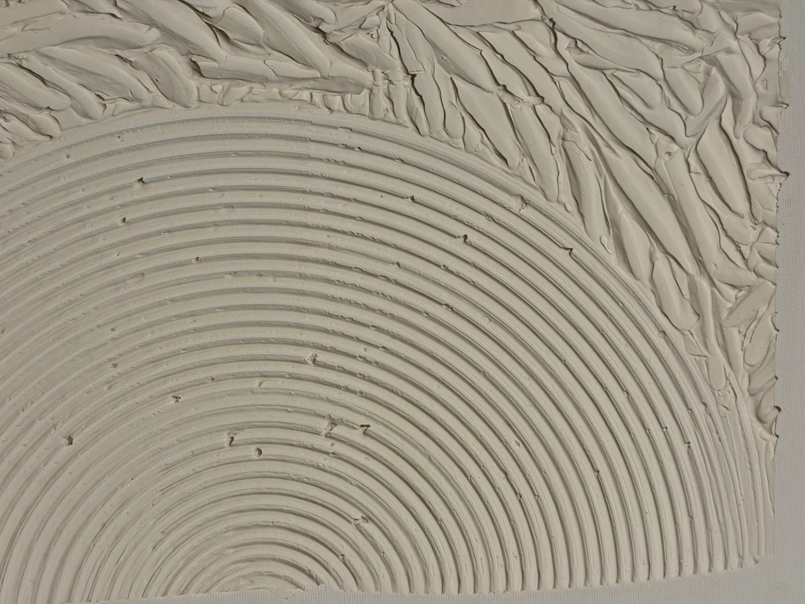
- Move. Step back until the whole painting reads as one shape and one temperature. Then step in close enough to see individual marks, ridges, or the edge where one color stops and another starts. A painting built in layers — texture paste, sculpted relief, metallic pigment under a top coat — often looks like a completely different object from three meters and from thirty centimeters, because texture only exists in the second distance.
- Read the title and any text last. Treat it as one more piece of information, not the answer key. A title can tell you what the artist was thinking about; it doesn't override what you actually saw in step 2.
- Sit with your own reaction. Not "is this good," but: does it hold your attention past the first look? What does it remind you of? Where would you want to encounter it again — in a hallway, over a desk, across a room you sit in every evening? That's the actual verdict, and it's allowed to be "no."
The four things worth naming, in more detail
Color and value. Not just which colors, but how they sit next to each other — whether one field advances and another recedes, whether a single warm mark is doing all the work against a cool ground, whether the palette is loud or restrained. Value (how light or dark a color is) usually does more structural work than hue.
Composition and scale. Where does your eye enter the painting, and where does it travel? Is the composition symmetrical and settled, or does it pull toward one edge? And critically: how big is it relative to your own body? A painting built at architectural scale — closer to a wall than to a page — behaves differently in a room than a small, intimate one meant to be seen up close.
Gesture and mark-making. Every mark on an abstract canvas is a record of a decision and a movement — fast or slow, corrected or left alone, poured or dragged or scraped back. You don't need the artist's name to read intent in the marks; the marks themselves tell you whether the process was controlled or let loose.
Surface and texture. This is the one dimension a photograph consistently underrepresents. Sculpted relief, raised paste, embedded metallic fragments, or gold leaf catch real light at real angles — a painting with heavy texture changes as you walk past it or as the light in the room shifts through the day, which a flat image simply cannot show.
Reading the title without letting it do your looking for you
Titles and wall text are useful — they can tell you the materials, the series a work belongs to, or what the artist was working through — but they're most useful after you've already formed your own impression, not before. Read first, then read about it, is the order that keeps the interpretive work with you instead of handing it to whoever wrote the label.
This matters more with abstract work than with a portrait, because there's no obvious subject to confirm or correct. A title like "Golden Passage" doesn't tell you what to see; it tells you one thing the artist was thinking about while making a diagonal field of sculpted texture and gold leaf. You're still the one who has to look at the diagonal, the texture, and the gold, and decide what they do to you.
What "liking" a painting actually means
Liking an abstract painting isn't a verdict on whether it's historically important, technically difficult, or expensive — none of those questions are what the five-minute method is answering. It's asking something narrower and more useful: does this specific object, in this specific room, keep pulling your attention back after the first thirty seconds are over?
That's also why the method makes room for genuinely not liking something. A painting can be well made, honestly worked, and still not be the one that holds you. That's not a failure of looking — it's the point of having looked carefully enough to know the difference between a painting you respect and a painting you'd actually want to live with.
From the studio
From the studio
I watch this happen almost every time someone stands in front of one of the Matter & Silence pieces in person: they walk up close first, the way you'd read a label, and then something makes them step back — usually the moment they realize the concentric rings on Echo of Silence aren't printed or painted flat, they're actually raised out of the canvas. Then they step in again, closer than before, to check with their eyes what their instinct already told them. That back-and-forth is the whole method, and nobody has to be taught it. It's just what a body does in front of real physical relief once it notices the relief is real.
I trained as an architect before I painted seriously, and I still can't look at a canvas without also asking how it occupies the volume of air in front of it — the same question I'd ask of a wall or a threshold. That's part of why I build so much of the surface in actual texture instead of only in color: paste, sculpted relief, metallic fragments under the paint. A flat mark only changes with your interpretation. A raised one changes with the light in the room and with where you're standing, which means looking at it is never really finished — you're still finding new information in a piece you've had on your wall for a year.
Frequently asked
Do I need to know art history to look at abstract art?
No. Art history can add context about a movement or an artist's influences, but the five-minute method above — look first, name what's structurally there, move closer and farther, read the title last, sit with your reaction — works without any background knowledge at all. It's built entirely on what's in front of you, not on what you can recall about a period or a school.
What if I don't feel anything when I look at an abstract painting?
That's a normal and valid outcome, not a sign you're looking wrong. Try moving physically closer and farther first, since scale and texture change a lot depending on distance. If you still feel nothing after that, it's fine to conclude the specific painting isn't for you — the method is designed to help you notice a real reaction when one is there, not to manufacture one when it isn't.
How close should I stand to an abstract painting?
Both distances matter, in this order: far enough that the whole painting reads as one shape and one temperature, then close enough to see individual marks and, if the surface has real texture, close enough to see the physical relief. Paintings built with sculpted texture, paste, or metallic fragments genuinely look different from across a room than they do from thirty centimeters away.
Should I read the title before or after looking?
After. Reading the title first tends to hand your first impression over to whatever the words suggest, rather than to what you actually see. Look for thirty seconds in silence, form your own read on the color, scale, gesture, and surface, and only then check the title — treat it as one added piece of information, not the answer.
Is there a "wrong" way to look at abstract art?
There's no fixed answer key to get right or wrong, since abstract work isn't organized around recognizing a hidden subject. The one approach that genuinely shortchanges a painting is skipping the looking altogether and going straight to the caption or the price — that hands the interpretive work to someone else before you've done any of it yourself.
If I like a painting, does that mean I should buy it?
Not automatically — liking it during a five-minute look is the first filter, not the last one. If a piece keeps pulling your attention back after that, the next reasonable step is to see it in more detail: at Perfeito Studio that means close-up photographs of the actual surface and a video in raking light, sent directly by the artist, along with the documentation — signed certificate of authenticity, Archive ID, curatorial dossier — that comes with any acquisition.
Found a painting that's staying with you?
If a piece keeps pulling your attention back after you've looked closely, tell Alyne which one — she'll send close-up photographs of the actual surface and a video in raking light, the closest thing to standing in front of it yourself.
Talk to the studio on WhatsApp
Published on